![Colour 2023 [PDF]](https://pdfs.asia/img/200x200/colour-2023.jpg)
21 0 2 MB
Future Strategies
Global Colour Forecast A/W 23/24 Our cross-industry Global Colour Forecast presents the must-know directions for A/W 23/24 and beyond. As consumer confidence and resilience rebounds, colours will be re-energised with rich and saturated levels, driven by the desire for healing, discovery and transformation Jenny Clark 10.01.21 · 18 minutes
WGSN original image
Overview Global Colour A/W 23/24 A er a period of immense challenge, consumers will adjust and focus on building for the future in A/W 23/24. As a result, our Global Colour Forecast encapsulates the diverse lifestyle influences and motivational forces that will drive consumers as we head into 2024, including wellbeing, discovery, transformation, simplicity and pleasure. There will be a stronger and more holistic focus on health and healing, and this will see so , mindful pastels evolve into brighter, digitally infused wellness colours that feel sensorial and energising. Rest and recuperation will also be important as consumers remain sensitive to overstimulation, and this, combined with a broader understanding of environmental issues and the ongoing desire to relax and recharge outside, will boost the importance of natural, quiet colours. On the flip side, travel and discovery will reignite the imagination. Near-neons will reflect the rebound of consumer optimism, and stimulating hyper-brights will return, inspired by growing interest in the metaverse, space travel and commerce, and the pursuit of pleasure. To help with your long-term forecasting and sustainability goals, we have organised this forecast into a Seasonal A/W 23/24 palette, a transseasonal Annual 2024 palette that will work across the entire year, and a Long-Term palette set to reach beyond 2024. Josh Sperling
Josh Sperling's exhibition, Spectrum, features a collection of free- owing sculptural paintings that use shifting hues and textures
1
Seasonal colour A/W 23/24
Limonite
Mindful Mauve 17-3014 TCX 147-55-21
134-67-16
051-62-15
056-26-07
060-71-33
071-65-06
088-76-13
095-32-22
098-26-13
114-57-24
122-25-24
134-42-26
Digital Lavender 15-3716 TCX Violet Light 18-3737 TCX Lazuli Blue
028-59-26
17-4139 TCX
19-4540 TCX
13-5309 TCX
19-0417 TCX
16-0430 TCX
Bay Leaf
Murky Green
15-0545 TCX
Liquid Lime
16-5808 TCX
Alpine Frost
Seafoam
Marine Teal
19-4326 TCX
Oceanic
Tranquil Blue
19-3953 TCX
030-41-18
017-23-07
036-74-35
034-56-24
049-86-36
Bitter Lemon 13-0650 TCX
16-0950 TCX
Dark Oak
Sundial
Carambola 15-0956 TCX
16-1148 TCX
19-1016 TCX Wholegrain 18-0933 TCX Candied Orange 026-58-35
154-51-37
010-46-36
008-23-14
015-33-25
020-54-37
Beacon Orange
16-1164 TCX
17-1464 TCX Intense Rust 18-1442 TCX Dark Cherry 19-1528 TCX Luscious Red 17-1663 TCX Luminous Pink 18-2436 TCX Pink Clay 014-73-08
2
14-1309 TCX
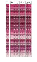
Our 25 seasonal colours for A/W 23/24 include brights, darks, mid-tones and pastels. Hyperbrights return, adding an extra punch, and they are balanced against intense darks such as Dark Cherry and Oceanic. Autumnal mid-tones and browns ground this palette, while pastels such as Seafoam and Pink Clay bring seasonal so ness.
* All colour names are speci c to WGSN. For colour codes, please refer to the following colour system reference pages: Coloro / Pantone TCX / Pantone Coated
Annual colour A/W 23/24 and S/S 24 15-6317 TCX
13-0941 TCX
Green Fig
Pineapple
Parchment
062-71-14
18-4214 TCX
14-4501 TCX
035-81-23
031-63-17
19-3424 TCX
Basalt
Pumice
Dusted Grape
024-65-27
Malachite
Sage Leaf
103-45-01
031-77-03
143-36-17
120-28-32
112-75-11
078-33-24
072-45-06
Galactic Cobalt
19-3952 TCX
14-4123 TCX Glacial Blue
022-62-16
19-5421 TCX
18-5611 TCX
010-42-20
010-38-36
022-40-26
Apricot Crush
16-0928 TCX
15-1247 TCX
Italian Clay
Astro Dust
Crimson
Ginger Biscuit
18-1250 TCX
16-1422 TCX
17-1537 TCX
18-1657 TCX
This palette of 15 annual colours will be important for both A/W 23/24 and S/S 24 seasons. This transseasonal selection includes four A/W 23/24 Key Colours: Astro Dust, Galactic Cobalt, Sage Leaf and Apricot Crush. The balance of colours in this palette includes a mix of pastels, mid-tones, saturated brights and neutrals.
* All colour names are speci c to WGSN. For colour codes, please refer to the following colour system reference pages: Coloro / Pantone TCX / Pantone Coated
3
Long-term colour A/W 23/24, S/S 24 and beyond
Sea Kelp
Sepia
Oat Milk
Terracotta
18-0529 TCX
19-1220 TCX
14-1208 TCX
18-1441 TCX
050-40-14
019-27-14
19-4203 TCX Black
Chalk
Optic White
11-4800 TCX
12-0304 TCX
153-19-00
037-93-00
034-84-05
120-22-18
000-64-00
Circular Grey
030-69-10
17-5104 TCX
Midnight Blue
19-3932 TCX
017-43-20
008-26-26
Cranberry Juice
19-1934 TCX
Our long-term palette of 10 colours is forecast to reach beyond 2024. New introductions include the dark red tone of Cranberry Juice, which replaces Bloodstone from previous seasons, and Sea Kelp, which replaces Olive Oil with a deeper shade. Circular Grey is another new addition, signalling a shi to more neutral tones for this colour group, and Unbleached Cotton is updated to the warmer off-white of Chalk.
* All colour names are speci c to WGSN. For colour codes, please refer to the following colour system reference pages: Coloro / Pantone TCX / Pantone Coated
4
Colour hues Global Colour A/W 23/24 We grouped the seasonal and annual palettes together by hue to highlight the dominant colour groups. There is a broader range of reds for A/W 23/24, incorporating autumnal and russet tones. Pink steps back, and purple divides into two distinct groups – warm and cool. Green and blue remain dominant, with an expansion of teal shades, and brown and grey maintain their relevance.
Pink
Green
Red
Orange
Blue
Brown
Yellow
Purple
For colour codes, please refer to the following colour system reference pages: Coloro / Pantone TCX / Pantone Coated
5
Grey
Key Colours A/W 23/24 Introducing our ve new Key Colours for A/W 23/24. These tones are set to play a signi cant role in all industries and de ne the mood of the season.
6
Digital Lavender Key Colour A/W 23/24
Coloro / Pantone
134-67-16
15-3716 TCX
Why is it key? Our 2023 Colour of the Year will remain closely connected to themes of digital wellness and escapism. In our Mental Health Entertainment report, we explore the growing demand for health-boosting digital therapy and 'calm-tainment'. As the pursuit of mindfulness becomes embedded in consumers' wellness routines, immersive VR platforms such as Tripp are evolving the quest into a gamified sensorial experience. Digital Lavender has a soothing and balancing property that connects it directly to this growing mental health movement. How to us e it: Embrace the health and wellness attributes of Digital Lavender by using it for smart fitness, wearables, training apparel, light therapy and sleep-focused products. This hue is perfect for virtual beauty filters and digital fashion skins, especially when combined with lustre and iridescence. This gender-inclusive purple also aligns with the # so masculinity trend, and can be applied to knitwear, loungewear, workwear, kidswear, footwear, bags and colour cosmetics.
7
WGSN original image
Colour evolution
Purist Lilac
Lavender Silk
Digital Violet
Digital Lavender
A/W 21/22
S/S 22
A/W 22/23
S/S 23 and A/W 23/24
Astro Dust Key Colour A/W 23/24
Coloro / Pantone
010-42-20
17-1537 TCX
Why is it key? Astro Dust is a captivating mid-tone red that connects to themes of space exploration. As commercial space travel evolves and space tourism becomes a reality, colours of the universe will excite and inspire us. This deep mineral tone evokes the dusty and desolate landscape of Mars and captures the desire to explore remote terrains and planets. Astro Dust exemplifies a shi towards off-kilter colours that feel intriguing and forwardlooking. How to us e it: Use this colour as a gender-inclusive red update for fashion essentials, outerwear and knitwear. Within the beauty space, implement for cosmetics using lab-grown colourants and extremophile products. Dial up surface texture through glossy finishes, stained wood effects, anodised and leather applications. Apply Astro Dust to large-scale furniture along with smart home products, TVʼs and home theatres. Colour evolution
8
Burnished Sunset
Astro Dust
A/W 21/22
A/W 23/24
Galactic Cobalt Key Colour A/W 23/24
Coloro / Pantone
120-28-32
19-3952 TCX
Why is it key? Back in 2019, we forecast Electric Blue in our 2024 Advanced Colour report as a high-impact, digitally derived colour. In A/W 23/24, hyperbrights will step up, influenced by next-generation colour technologies, and Galactic Cobalt will be the most important and influential of these. This intense and dynamic hue also takes inspiration from the new space age and the evolution of the metaverse. Transformative experiences that are driven by technology will influence the rise of this intense and dynamic blue, and consumers will associate it with escapism and extended reality. How to us e it: This versatile colour can be used in multiple ways. Embrace its technical character for highly functional activewear, smart fitness, computers, tablets and virtual experiences. Treat it as a jewel tone for party dresses, occasionwear, jewellery and colour cosmetics. Elevate and intensify Galactic Cobalt through transformative finishes, satin lustre, metallics and anodising. It can also be used in playful ways for kidult beauty, kidswear and gaming.
9
Colour evolution
Satin Sky
Galactic Cobalt
S/S 23
A/W 23/24
Sage Leaf Key Colour A/W 23/24
Coloro / Pantone
072-45-06
18-5611 TCX
Why is it key? Slowed-down lifestyles have introduced consumers to new or forgotten concepts around rest, as explored in our report, Post-Covid-19 Rest: Shi s & Strategies. As lifestyles adjust further, consumers will be sensitive to over-stimulation, and they will look for environments and colours that reduce anxiety and stress levels in the brain. Sage Leaf is a quiet and settling green that instills a sense of contemplation, rest and reflection. How to us e it: Sage Leaf will be an important colour for pared-down, considered design. Within the home, itʼs a great all-rounder for walls and furniture, and it can also be used to so en smart home devices. Embrace Sage Leaf's therapeutic quality for bath and body products, connecting it to algae- and seaweed-based ingredients. Apply this so green to all fashion categories, with a focus on elevated utility, better basics and smart separates. Combine with texture to instill a sense of comfort, working with faux furs, so knits, brushed jersey, velvets and stone-washed linen.
10
Colour evolution
Leaf
Wavellite
Jade
Sage Leaf
A/W 21/22
S/S 22
A/W 22/23 and S/S 23 A/W 23/24
Apricot Crush Key Colour A/W 23/24
Coloro / Pantone
024-65-27
15-1247 TCX
Why is it key? In our Advanced Colour 2026 report, we forecast the evolution of mindful pastels to a full spectrum of saturated, vitamin-balancing hues. By A/W 23/24, orange will step up and provide a fruity injection of energy for the season. Apricot Crush is an activating mid-tone with a restorative quality, aligning with a focus on balanced lifestyles that nourish the body and mind. How to us e it: This orange will bring a warm luminosity to the home, both indoors and out. With its so , sun-bleached quality, Apricot Crush will pair easily with neutrals, and is suitable for textiles, glass, bath and bedroom products. Embrace its playful side for joyful beauty products, fragrance, skincare and hair colour. For fashion, this is a versatile and gender-inclusive tone, making it great for knitwear, loungewear, activewear and outerwear. Also work it into seasonal prints, plaids and stripes. Embrace this colour's restorative attributes for consumer tech products that are focused on health and wellness.
11
Colour evolution
Peachy
Faded Citrus
Papaya Smoothie
Apricot Crush
A/W 21/22
A/W 22/23
S/S 23
A/W 23/24
In uences
Naturally Brilliant Colour One of the most exciting exhibitions of the year, this display at Kew Gardens, London, showcased Pure Structural Colour, from its natural origins to the stunning man-made technology by Lifescaped. This landmark exhibition introduces next-generation colour technology to the public.
12
Blue: In Search of Nature's Rarest Colour This wonderful new book by Kai Kupferschmidt delves into the history and chemistry of the colour blue. The science journalist unravels its natural origins and travels the world to understand the alchemy and science behind blue, touching on the discovery of pigments and dyes.
Beyond the Road
Travys Owen
This must-see multi-sensorial exhibition debuted in 2019, and has now reached Asia, opening at the Hyundai Seoul Alt. 1 Gallery in South Korea. Designed by experts in immersive technology, it combines audio effects and neon colours to enhance displayed artworks and sculptures. The fully immersive concept gives visitors a fantastical contemporary art experience.
Johannesburg photographer and artist Travys Owen has a striking approach to colour. His figurative work is highly saturated and shaped in postproduction to achieve hyper-real effects. The artist has most recently worked with musician Wayne Snow, and exhibited his work at the Kalashnikovv Gallery, Johannesburg.
Omar Ibáñez and Francisco Muñoz RGR art gallery in Mexico City presents the works of Omar Ibáñez and Francisco Muñoz. These two contemporary artists use colour in distinctive, graphic ways. Omar Ibáñez's work explores geometry and the integration between painting and sculpture, while Francisco Muñoz refers to the chimallis or shields used in ancient Mesoamerica.
1 234 Action points
Build in transseasonality
Health-check your palette
Take steps to minimise impact
Acknowledge the gender spectrum
Choose colour with longevity in mind. Through careful planning and data analysis, make responsible choices and define the lifecycle of the hues in your palette
Ensure your palette is feasible and check which colours work on each substrate and product type, before sharing with your supply chains. If you would like your Coloro palette healthchecked, or if you would like feasibility data for our 50 Coloro A/W 23/24 colours, click here for further information
Minimise your environmental impact by using low-impact chemicals, dyes and pigments, combined with energyefficient processes. Seek certified sources of synthetic and natural colours, and work with suppliers that follow a regenerative strategy. Share the responsible steps you are taking with your consumers
As inclusion becomes more important to consumers, make colour choices with gender fluidity in mind. Break down preconceived colour associations and choose hues that allow people to explore their gender identity
13
Coloro
Colour Reference A/W 23/24
014-73-08
154-51-37
010-46-36
010-38-36
008-26-26
008-23-14
010-42-20
015-33-25
022-62-16
017-43-20
020-54-37
022-40-26
024-65-27
026-58-35
030-69-10
031-63-17
030-41-18
019-27-14
017-23-07
028-59-26
035-81-23
036-74-35
034-56-24
049-86-36
051-62-15
050-40-14
056-26-07
062-71-14
060-71-33
071-65-06
072-45-06
078-33-24
088-76-13
095-32-22
098-26-13
112-75-11
114-57-24
120-28-32
122-25-24
120-22-18
134-67-16
134-42-26
147-55-21
143-36-17
031-77-03
000-64-00
103-45-01
034-84-05
037-93-00
153-19-00
* This is a reference guide only. Colours on computer screens vary. Find out more about Coloro here
14
Pantone TCX
Colour Reference A/W 23/24
14-1309 TCX
18-2436 TCX
17-1663 TCX
18-1657 TCX
19-1934 TCX
19-1528 TCX
17-1537 TCX
18-1442 TCX
16-1422 TCX
18-1441 TCX
17-1464 TCX
18-1250 TCX
15-1247 TCX
16-1164 TCX
14-1208 TCX
16-0928 TCX
18-0933 TCX
19-1220 TCX
19-1016 TCX
16-1148 TCX
13-0941 TCX
15-0956 TCX
16-0950 TCX
13-0650 TCX
16-0430 TCX
18-0529 TCX
19-0417 TCX
15-6317 TCX
15-0545 TCX
16-5808 TCX
18-5611 TCX
19-5421 TCX
13-5309 TCX
19-4540 TCX
19-4326 TCX
14-4123 TCX
17-4139 TCX
19-3952 TCX
19-3953 TCX
19-3932 TCX
15-3716 TCX
18-3737 TCX
17-3014 TCX
19-3424 TCX
14-4501 TCX
17-5104 TCX
18-4214 TCX
12-0304 TCX
11-4800 TCX
19-4203 TCX
* This is a reference guide only. Colours on computer screens vary. Find out more about Pantone here
15
Pantone Coated
Colour Reference A/W 23/24
503 C
213 C
Red 032 C
200 C
7428 C
188 C
7419 C
181 C
7514 C
7600 C
Orange 021 C 1
7585 C
1565 C
716 C
4685 C
7508 C
7575 C
7595 C
Black 5 C
7570 C
134 C
7549 C
7563 C
388 C
5777 C
7750 C
5605 C
558 C
368 C
5635 C
5487 C
3298 C
628 C
7470 C
309 C
543 C
284 C
287 C
288 C
2767 C
2645 C
2665 C
681 C
525 C
Warm Gray 2 C
Cool Gray 8 C
431 C
7527 C
7541 C
426 C
* This is a reference guide only. Colours on computer screens vary. Find out more about Pantone here
16
Colour methodology WGSN's A/W 23/24 Global Colour Forecast is developed and peer-reviewed by our international team of forecasting experts, who combine research, insight, analysis and critical debate throughout the two-month process. Our contributors come from the Americas, Asia, Europe and Africa, offering a truly global view of the forces shaping colour trends. We assess WGSN's proprietary retail, e-commerce and social media data to track the path of the colours and inform our decision-making process. To reflect the needs of multiple industries, our palette is organised into three sections – Seasonal, Annual and Long-Term – which define the longevity of each colour. Over 40% of the tones in this palette are carried forward from a previous season. The five Key Colours are forecast to play a significant role for all industries and define the mood of the season. All colour names are unique to WGSN and are evaluated by our Equality Vision Team. Coloro Coloro is the primary colour system for WGSN forecasts. You can purchase the A/W 23/24 Key Colours here. Each tone in the Global Colour Forecast is selected directly from the Coloro library of 3,500 contemporary hues. Each colour is then rigorously tested by Coloro experts to ensure achievability across substrates and acceptable fastness, so you can trust that they are feasible before lab dipping. Coloro is a beautifully designed system backed by a technically sound approach. It offers physical and digital products, an extensive colour library, and expert advisory services. Find out more here.
17
WGSN’s forecasts are created by our global team of experts Colour forecas ting team
Yvonne Kostiak, Senior Strategist, Active
Contr ibutors
Jenny Clark, Head of Colour
Gemma Riberti, Head of Interiors
Europ e
Helen Palmer, Head of Materials and Textiles
Clare Varga, Head of Beauty
Arantxa Ravettino, Trend Specialist
Sara Maggioni, Head of Womenswear
Annie Johnstone, Analyst, Beauty
Amer icas
Erin Rechner, Head of Kidswear
Reiko Morrison, Head of CMF, Consumer Tech
Sofia Martellini, Strategist, Youth and Womenswear
Jane Collins, Senior Strategist, Footwear and Accessories
Martina Rocca, Strategist, Insight
APAC
Joanne Thomas, Head of Content, Coloro
Alison Ho, Consumer Researcher
Nick Paget, Senior Strategist, Menswear
18